Custom Water Can Design: 9 Rules for Art That Prints Well
A can is round, small and seen from three feet away. Here are nine design rules that help your custom water can look sharp in a cooler, on a phone screen and in a guest's hand.
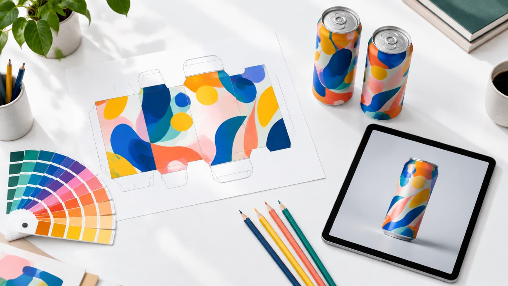
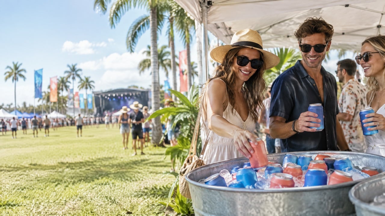
Most can designs look great on a laptop. Then they arrive in the real world: wrapped around a curved surface, sitting in an ice tub under dim event lighting, half covered by a hand. Suddenly the tagline is too small, the logo is on the back, and the QR code sits right on the seam.
The good news is that these problems are easy to avoid once you know how a can is actually seen. You do not need to be a packaging designer. You need a few rules that respect the shape, the size and the moment the can is used.
Here are nine practical rules we share with brands, agencies and in-house designers before they send their art to production.
What makes a good custom water can design?
A good custom water can design has one clear focal point that reads from about three feet away, strong contrast, minimal text, and a QR code placed where a thumb naturally lands. It treats the can as a 360-degree surface, keeps important elements away from the seam and the curved top and bottom edges, and is checked on a printed proof, not only on a screen.
Everything else is style, and style is where your brand shines.
Rule 1: Design for the front, then the wrap
A can is seen mostly from one side at a time. Decide which side is the "front" and put your logo or main graphic there. Then let the rest of the wrap support it: a pattern, a secondary message, the QR code.
- Front: logo or hero graphic, centered.
- Sides: pattern or color that continues the story.
- Back: QR code, a short line and any required details.
Rule 2: One focal point, not five
Cans are small. If you add a logo, a slogan, an illustration, a pattern and a hashtag, nothing wins. Choose one hero element and let it breathe. The most memorable cans are often the simplest: a strong color and a confident mark.
Rule 3: Size text for the real viewing distance
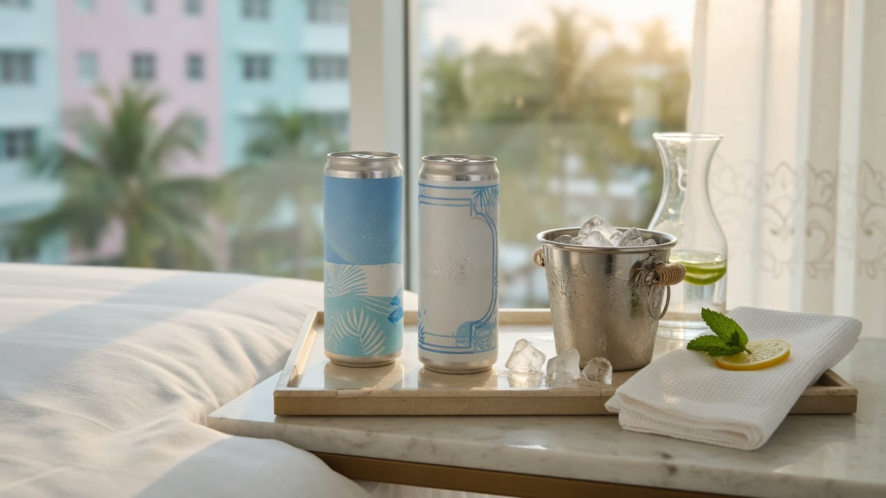
People see your can from a cooler, a bar tray or across a table. Text that looks fine at 100 percent zoom disappears in real life.
- Keep brand names and short lines large and bold.
- Avoid thin script fonts for anything important.
- Limit body text to what is truly needed.
A good test: print the design at actual size, wrap it around a can, and look at it from across the room.
Rule 4: Respect the seam and the edges
Every wrap has a seam where the art meets, and the top and bottom of the can curve away from the eye. Keep logos, faces, text and the QR code away from those areas. Our artwork templates for digital can printing show the safe zones for each size.
Rule 5: Think about color on aluminum
Aluminum changes how color looks, and that can be a feature.
- Bright, saturated colors pop under event lighting.
- Metallic effects can come from letting the aluminum show through in some areas, depending on the print method.
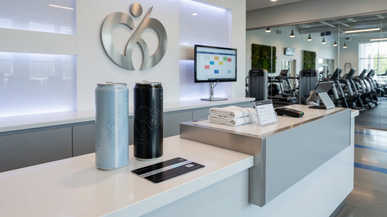
- Very dark designs can look dramatic, but check that your logo and QR code still have strong contrast.
- Brand colors should be checked on a printed proof. Screens and printed aluminum never match exactly.
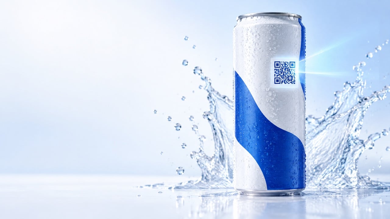
Rule 6: Place the QR code like it matters
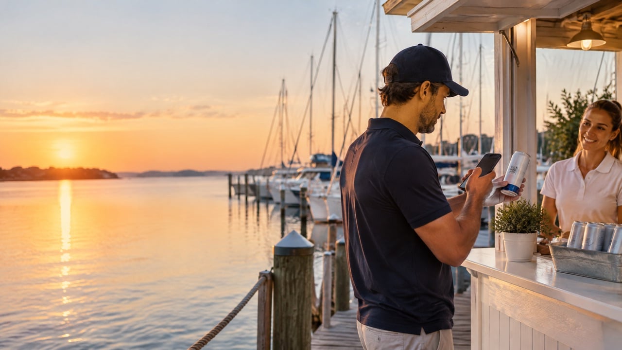
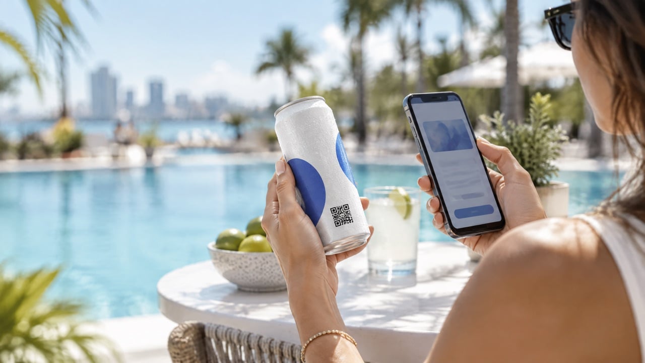
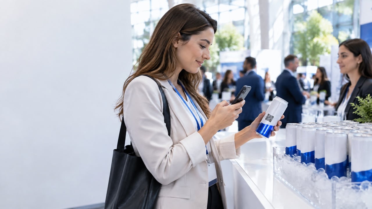
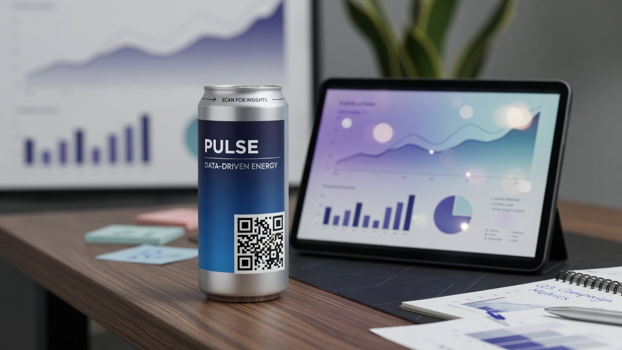
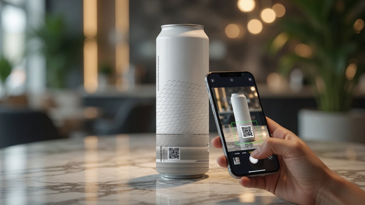
A QR code is free on every We Can It can, and it is often the most valuable part of the design. Treat it that way.
- Give it a quiet zone. Leave clear space around the code.
- Keep it on a flat-looking area, away from the seam and edges.
- Use dark on light for the code itself, whatever the rest of the design looks like.
- Add a reason to scan, such as "Scan for the menu" or "Unlock the launch offer."
- Test on several phones in real light before approving.
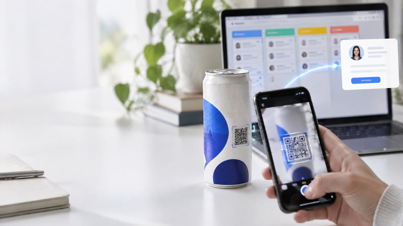
If you want the scan to do more than open a link, Journeys turns it into a full experience with results you can report. Our explainer on what a QR-powered can is covers how the code is printed and tested.
Rule 7: Choose the right print method for the design
Your print method shapes what is possible.
- Labels start at 21 cases (504 cans). They are ideal for pilots and single events, and work best with designs that have clean edges.
- Digital print starts at 100 cases. Art is printed directly on the aluminum for a seamless, premium finish and full wrap coverage.
Many brands start with labels to test a design, then move to digital print once the look is proven. Our labels technology page and packaging page explain both.
Rule 8: Match the size to the setting
The same art behaves differently on each size.
- 12oz Regular: the familiar shape, wide canvas, works for most designs.
- 12oz Sleek: taller and slimmer, elegant for hospitality and fashion, but narrower, so simplify the front.
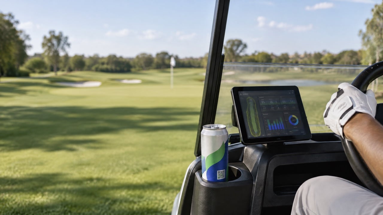
- 16oz: more surface for bold patterns, popular for fitness, golf and outdoor events.
Rule 9: Approve a real proof, not a mood board
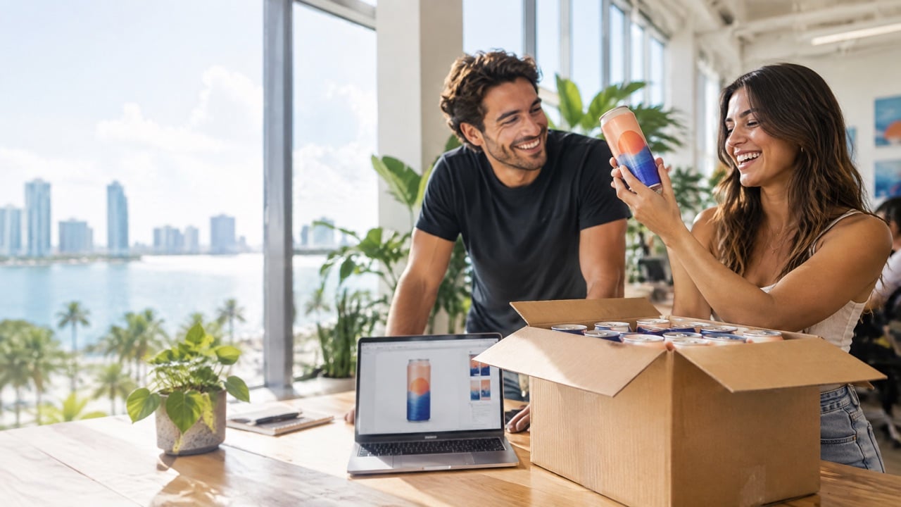
The production clock starts when you approve your digital proof, so this step deserves care.
- Check spelling on every word, twice.
- Scan the QR code on the proof.
- Confirm the water type and size match your order.
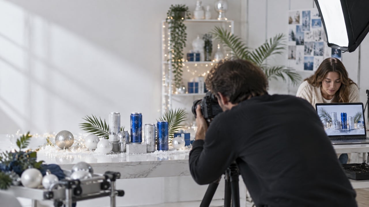
- Look at the 3D mock-up from every side. Our live 3D can designer helps here.
We Can It typically delivers in about 2 to 3 weeks from artwork approval, so a careful proof saves time rather than costing it.
Common design mistakes to avoid
Do not
- Put the logo across the seam.
- Use tiny, thin or light-on-light text.
- Squeeze the QR code into a corner without space around it.
- Design only on screen and skip the printed check.
- Copy a busy print ad onto a small round surface.
Do
- Pick one hero element and protect it.
- Keep critical items in the safe zones.
- Use strong contrast for the logo and the QR code.
- Give guests a reason to scan.
- Plan a simple design system you can reuse for seasonal editions.
Designing a family of cans
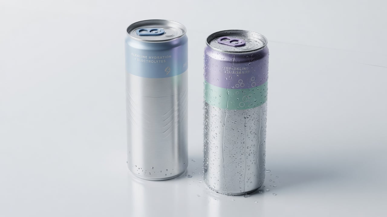
If you plan to offer still, sparkling and alkaline, design them as a family. Keep the logo and layout the same, and change one element, often the color, to signal the water type. Guests learn the system in seconds. Our post on running alkaline and sparkling under one brand shows how.
Before and after: fixing a typical first draft
Most first designs we review share the same few issues, and they are easy to fix once you see them.
A typical first draft places the logo exactly where the seam falls, so on half the cans it looks split. The tagline is set in a thin script that disappears in an ice tub. Five different elements compete for attention: logo, slogan, website, social handles and a busy photo. The QR code sits in the bottom corner, curving away from the camera.
The revised version moves the logo to the center of the front panel and makes it larger. The slogan becomes three bold words, or disappears entirely. The photo is replaced by a simple pattern in the brand colors that wraps around the can. The website and social handles move into the QR experience, where they actually help. The QR code moves to the back, on a clean white area with space around it and a short line that says what happens when you scan.
The result looks simpler on screen and far better in a guest's hand. That is usually the sign that a can design is ready.
A quick self-review before you send art
- Can you identify the brand from across the room?
- Is anything important touching the seam or the edges?
- Does the QR code scan from a printed proof?
- Would the design still work as a smaller label?
Frequently asked questions
What file format do I need for custom water can artwork?
Use our artwork templates, which are set up for each can size with safe zones and the seam marked. Vector files for logos and high-resolution images help the final print look sharp. A product advisor can review your file before you approve the proof.
Can I put a QR code on my custom water can?
Yes. A QR code is included at no extra cost on both labeled and digitally printed cans. Place it away from the seam with clear space around it, and test it on several phones before approving.
What is the difference between a label and digital print on a can?
A label is printed separately and applied to the can, which suits small first runs from 21 cases. Digital print puts the art directly on the aluminum for a seamless full wrap, starting at 100 cases.
How long does production take after I approve my design?
We Can It typically delivers in about 2 to 3 weeks from artwork approval. Industry timelines are often 8 to 12 weeks.
Will my brand colors print exactly as on screen?
Screens and printed aluminum never match perfectly. Check your colors on the printed proof, and favor strong contrast for your logo and QR code.
Get a quote for custom water cans with your design
Ready to see your art on a real can? Try the live designer, get an instant estimate, and a product advisor will follow up by email to review your artwork before production.